[Writer Post] How I Was Ripped Off
It’s Wednesday. Time for a blog post. Whee… So I checked out a meme on Facebook a few weeks back – how will you die based on your Meyers-Briggs personality test. Mine sounds about right – ESFJ, dies by telling the wrong secret to the wrong person. Yep. I can see that. It’s not that I go out intending to blab secrets just sometimes being a storyteller it just happens. And sometimes it’s a situation where the ‘the story needs tellin’…” (kinda like the “just needed killin'” defense).
It’s time to tell one of those stories. I’ve mentioned in the past that I was ripped off by a Kickstarter project. Out of deference to people who know this person and the “benefit of the doubt” good person in me, I’ve put off point fingers and naming names. I’m done with that. Yes, I realize Kickstarter is a risk. But this is completely different this was a scam from the beginning, and I got sucked in. This is a project specific thing not a sweeping condemnation of crowdsourcing – just to be clear.
About a year ago I backed a simple little Kickstarter because it would be a fun promotional thing for my writing stuff. I had the creator on Facebook. We had tons of people in common. So I started out with a minimal investment – that after a discussion with Jimmy was bumped up to a bigger investment. The project was a thing called “Pencil Dice” – it’s a wooden pencil with monogramming and pips on the six sides that you can “roll” in a game. It was cheesy and funny and we thought they’d be a good thing to give out at conventions. So we bought in at a storefront level for like a 1000 pencils for $250. This thing blew through stretch goals like nobody’s business. The updates were encouraging and often. Then… it all went to crap.
The creator stopped communicating regularly – and when he did it was platitudes and then flat out lies. Lies that were documented. We confronted him on social media, through Kickstarter, and in person – Pencil Dice wasn’t the only project he failed to complete. The comment lists on Kickstarter are long and voluminous – and angry. Other people and companies got involved to help other projects out because their names were being tarnished. But time has passed. Nothing has happened. And when noise started rising about law suits and official paper work, he moved to another state (for personal reasons) and changed his name (slightly). He’s been defensive and derogatory to those who have chosen to confront him – when he deigns to reply at all. He’s removed his Wikipedia entry and scrubbed his company D20 Entertainment off the web. And I’m done.
He’s still on Facebook – we still have friends in common – but Ken Whitman, I will never let anyone I know do business with you. Don’t let is “cute” name change to “Whit Whitman” (for acting purposes I’m sure). You’ve screwed over me, hundreds of other people for thousands of dollars. You’ve damaged the reputations of companies and artists who gave you license to use their names or their products. You’ve shown no remorse, all the signs of a pathological liar. My $250 isn’t a lot of money – but it was a large chunk of my promotional budget for this last year, which kept me from doing more things for my readers/fans. Ken Whitman hurt my business, my budget, and my faith in humanity. Ken Whitman’s lies, cons, and cluelessness are documented and should not be allowed to stand.
Yes, there are at least two sides to a story. This is my story. My experience with this man. I’m almost glad he changed his name and his Facebook profile. I kept him on my feed to see if he’d come clean, apologize, admit to any wrong doing. Now I don’t have to bother with unfriending him. (Actually he took it private and blocked me.) It’s done. I’m done.
Seriously, I know Crowdsourced things are a risk. But if you overextend, have issues come up, or simply screw up – man up and admit it. That’s all a lot of us asked for in the beginning. And I know manning up is hard (I had the screwed up credit to prove it’s hard to admit to some things because I wanted it to “just go away), but in the long run it’s better all around. This is so far beyond that now.
[Pen/Pencil Review] Pentel Orenz 0.2mm Mechanical Pencil
I still have a few things from a past JetPens order that I haven’t reviewed yet. This mechanical pencil is one of those – the Pentel Orenz. The Orenz comes in a 0.2mm lead – so I had to try it…

Apparently I have a “sweet spot” when it comes to fine points – it’s between a 0.3mm and 0.7mm. This pencil ran a bit too fine point for me. I’m to firm a writer – no matter how “light” I keep my grip, I snap part of the lead almost immediately. No matter WHAT the website/literature says. The good thing is that the lead still manages to extend from the shield so you can still write with it. But still… it’s an adjustment.

The barrel is a classic Pentel style. I bought the black barrel. There are rings etched in every narrowing circles along the grip leading to a concave point with stepped ridges down to the retractable shield – letting the lead guide hold the lead secure, and the guide is rounded. It doesn’t grab paper. I think this pencil will work better for artists who know how to work with such a fine lead. Or if you only advance it a teensy bit beyond the guard at a time.

For a mechanical pencil, it does feel good in the hand. It’s about 5.5″ long with a balanced feel. The silver metal clip feels secure and matches the eraser cap. The pencil feels light but solid, as I would expect from Pentel.

This is a pencil that has to be ordered from a retailer like JetPens. This is still a Japanese line and not yet widely available in the US.
The numbers:
1. How does it work? – 0.5 It works better than it should, but the packaging that says the mechanism PREVENTS breakage isn’t completely accurate. I still snap the lead.
2. Grip and feel – 1 – It’s a basic Pentel barrel. There’s a nod to a grip in the plastic barrel, but not much. The barrel is plastic with metal accents that feels good for what it is.
3. Material – 1 It’s strong quality plastic with solid metal clip and tip. The lead protection guide is where the innovations went into the pencil.
4. Overall Design – 0.5 – It’s solid. They tried really hard to make the super fine lead as unbreakable as possible but it’s still a super fine lead and there’s still breakage..
5. Price Point – 0.5 – You have to get this online or through a retailer like JetPens. It’s running $8.25 (which is a bit pricy for a mechanical pencil) and it doesn’t come with extra lead – so it’s more of a specialty thing. But if you’re a connoisseur/collector it’s not that bad. But you still have to invest in lead.
3.5 out of 5 Bronze Pencils

[Writing Post] Shows, NANOMO, and Life
It’s Wednesday. I need to come up with a blog post. I did my last show of 2015 last weekend at the Dallas Public Library. I was on a panel with Rachel Caine, Julie Murphy, and Jenny Martin about writing. My table was next to the amazing Jessica von Braun, and her incredible art. Talked to many people about writing and books and a wide array of things. And now I’m ready to take the holidays to be with family, write, and recharge for 2016. My calendar is starting to fill up.
Being November, I feel obliged to mention that I do not do NANOMO. My goal is to write at least a little bit over the long term – not a binge. (Not that there’s anything wrong with a binge – been there done that.) But it always seems like a big diet – a great idea when you start but when you fall off it’s really hard to get back on, resulting in a sense of failure. Which I know most people don’t feel, but I do – and I’ve got enough things to mess with my head to add to it with that. So I go for slow and steady (until I have a deadline… then all bets are off).
It’s getting back to that point though – deadlines. I’ve taken on an article writing thing for ASFA – at least once. Need to move forward on several projects – including revisiting a collaborative effort – (and I am), and finish getting the house ready for the fan group to descend this week (with the added self-inflicted stress of wondering how Freya is going to handle a crowd of people).
Whee… the glamorous life of a writer. And now, back to the WORK of it.
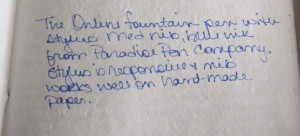
[Pen/Pencil Review] ONLINE Switch Fountain Pen with Stylus
This week’s pen is an interesting combination of Old School and New School – it’s the Online Switch Fountain Pen with Stylus that I picked up at Paradise Pen Company this past weekend. The Online brand is out of Germany and makes pretty nice modern fountain pen. This is no exception. The Switch is part of their “Young” line.
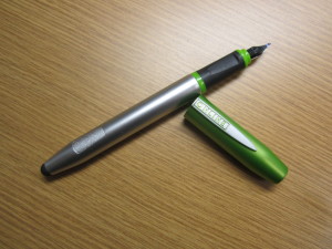
The Online Switch gives a nod to those of us who live on the edge between old school writing and the digital world by creating a fountain pen with a stylus in the barrel. And they do it with style and quality and with the beginner fountain pen user in mind. And…by reading up on Paradise Pen Company and ONLINE’s website, this pen works with an App called “ONLINE Discovery – Learn to Write” which is a collaborative effort to help kids (or anyone) learn to write on both paper and tablets. I’ve just downloaded it, but haven’t had a chance to play with the app yet (I JUST found out about it). But HOW COOL IS THAT?
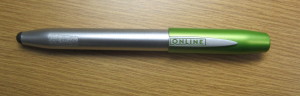
The Switch is about 5.75″ long with the cap on and 6.25″ long with the cap posted. The barrel is about the size of those Kindergarten pencils – wider than your typical pen, but with a soft-ish plastic and a molded ergonomic grip. The light plastic is durable but comfortable and pretty well balanced. The cap posts securely but has no clip and comes in some fun colors. The website only has a few, I managed to get a lime green one at the Dallas store.
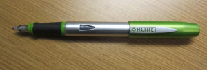
The iridium nib is a medium width – but a thin medium. So the line doesn’t seem bulky. The ink flowed well on handmade paper with no skipping, feathering, or smearing – it does come with a single blue ink, standard cartridge. The barrel is long enough you might be able to get the long cartridges in it. The stylus is quite responsive without being squishy. LOVE THAT.
The quibble? As with another pen/stylus combo… The cap posts over the stylus, so if you’re going back and forth between screen and paper, you have to either leave the cap off or keep taking it off and on – but there’s no other way to really do the stylus with this pen.
The numbers:
1. How does it work? – 1 It works really well. The stylus is responsive. The nib and ink flow smoothly on paper without skipping or pressing hard.
2. Grip and feel – 1 – This is designed with comfort and ergonomics in mind. The triangular grip fits well. The soft plastic barrel is comfortable with great balance.
3. Material – 1 It’s strong quality plastic with softer bits for comfort and ergonomic molding.
4. Overall Design – 0.5 – The cap doesn’t have a clip. That’s a problem. No good way to secure it to a pocket or notebook. If you have the cap posted, you can’t use the stylus.
5. Price Point – 0.5 – You have to get this online or through a store like Paradise Pen Company. Paradise currently has them on sale for $19.99 – which is pretty good for a decent beginner fountain pen (and the app is free) – but it’s an investment pen and you have to find it.
4.0 out of 5 Bronze Pencils

[Writer Post][Conventions]Tyler Part 2: The Good, The Bad, The Ugly
It’s been a pretty long Wednesday, but I started sketching out the second part of the Tyler Rose City Comic Con post – this one is more of a traditional convention report. Almost said “after action” – my Day Job has bleed over – no, there won’t be any corrective actions for an improvement plan. Just my opinion of what went down. I do call it “The Good, The Bad, and The Ugly” because with any live event has something of all three. Now the question is… do we go in this order or go backward?
Let’s get it out of the way…
The Ugly
This is the third venue for this convention in its three years (for good reasons – they outgrew the last two immediately). However, the only place they could get was the Fairground Buildings (PLURAL) that were built in the 1930s and not actually updated in goodness knows when. There were mostly functional ceiling fans, but no air conditioning. When a City Employee tells you they hesitated to rent the show the buildings, that’s Not A Good Thing.

The buildings were awful. Our building had an indoor bathroom that wasn’t cleaned or serviced the whole weekend. Half the trash cans were catching water from the MULTIPLE roof leaks. One vendor in our building had to move their stuff around because a MAJOR leak required a rolling dumpster to catch the torrent from broken ceiling tiles. I think I had a touch of Con Crud because of two days of Warm/Humid (to the extreme) followed by Cold/Damp.

Apparently the Staff intended on having some of the event entertainment and stuff outside with no real alternative plan until it actually started to rain. The confusion was understandable – but… having an “independent pro wrestling” ring and shows in one of the buildings with vendors and a panel stage. That was beyond weird – and they were on the WRONG SIDE of the building. The ring and their audio/visual stuff ended up blocking some vendors, and when they did a show/demo, their followers blocked the way into the building, which deterred customers. Which leads to…
The Bad
Having vendors in the same room as panels. This is an “iffy” idea at best. It seems rude to try to sell stuff while a panel discussion or demonstration is going on. But it’s very DISCONCERTING to know that there will be after-hours things like wrestling matches, cosplay contests, and a party going on while all your stuff is basically only covered with a sheet. Yes, security roamed the place. No, nothing was messed with, but it was an added stress – especially when you’re not in a hotel that does room resets. Jimmy helped reset chairs on Sunday, and we all pitched in to pick up trash (which wasn’t ever taken out).

The vendor map layout was like the Pirate Code – more like guidelines than rules. I think at least once I heard, “oh, we can’t find you on the map, so you can just set up here…” which then creates a domino effect. Extra tables were brought in and shuffled around. Vendors were split between two buildings with two other buildings between. With the rain, that affected sales. I was in the building with panels – the celebs and other artists were in the OTHER building (and the Celeb Q & As were also in that building). There wasn’t a good way to create a flow down into our building.

The Schedule had a bit of Yahtzee cup going on, too. Some things were canceled or scaled back or preempted because everything had to be inside due to the weather. This is why you always have contingency plans. Major, major contingency plans.

Though there was no controlling the weather, it was definitely a factor. There should’ve been a lot more people, but the rain kept a lot of people away. It also kept people in singular buildings for the most part. There wasn’t nearly the to-ing and fro-ing that the organizers would have liked – because dodging the rain, but sales were probably down because of the weather.
The Good
There is Good. There’s always good. It’s not all gloom and doom. Promise. Despite the weather-related issues, we sold books – enough to make it worthwhile to come back. We talked to many people. Didn’t make anyone cry in the critique portion of the Short Story Contest. I was on a panel with Timothy Zahn. We actually got to SEE part of the show because the stage was RIGHT. THERE. (Which is how I was able to be heckled by Gil Gerard. Enjoyed our neighboring vendors.

The convention organizers are Good People. They have really good intentions, and if they can get into a stable space they can actually start developing a super show. They put on a GOOD one now, but most conventions/shows can build on successes and learn from weird logistics by being in the same place more than one year…this crew hasn’t had that ability. They are doing an awesome job in a hard situation that may or may not be easily resolved depending on whether or not they can get the good facility – which was across the street and hosted the GUN SHOW that same weekend.

The celebrities and other vendors were genuinely nice and professional. It was a joy to work with them – and be in same building as they were for a short amount of time. And the food vendor didn’t rip people off like some convention center food vendors do – good food, decent prices, and they had a buy a cup and drink for $5 get refills for a $1 all weekend deal. That was AMAZING!

The show has a TON of potential. It’s affordable, they get some decent guests for their size. They just need to have the time and space to work the kinks out and figure out what works and what doesn’t and smooth out the rough edges. That takes time. But I think they can make it work if they get the venue situation figured out.

So, yes, it’s something I would do again – in a heartbeat. I want to see this show succeed. I want them to continue. And now onto the We Heart Art: Creating New Worlds Event at the Dallas Public Library on Saturday!
[Pen/Pencil Review] Faber-Castell Perfect Pencil
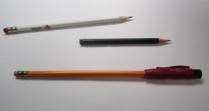
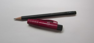
Okay, so I’m just going to go ahead and do my second Faber-Castell review from the Dallas Pen Show and just get it out of my system. Why? It’s something I never knew I needed, wanted, or would be one of those things that make me go “DUDE!” I’m talking about the Faber-Castell Perfect Pencil.
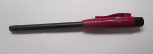
Faber-Castell has created extenders for wooden pencil users that are caps that let you use wooden pencils longer – which is a cool idea for artists or others who use wooden pencils down to nubs. Some are really nice and expensive. Then there’s this thing. The Perfect Pencil is…AWESOME. This is a purplish CAP that slides over the point of the pencil. It has a clip that lets you carry a wooden pencil in a pocket or portfolio securely all while protecting the lead point from snapping off. The cap also slides over the eraser end to extend the length of the pencil.
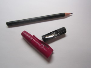
The Perfect Pencil cap is about 2.75″ long and comes with one of Faber-Castell’s black stubby pencils, so the initial length is about 5.5″ long – with the cap posted to the eraser end, it makes the pencil itself about 7.5″ long. The remaining super cool thing? The twisty looking top? It pops out as a sharpener. So you ALWAYS have a SHARP wooden pencil.
Then there was a further test – because I needed to create some storyboards at work for a project (one that totally lends itself to pencil work) – I tried the cap with generic pencils – both round and hex. The round pencil was a bit tight, but they both worked. So you don’t HAVE to use the Faber-Castell pencils with the Perfect Pencil – but they are really NICE pencils. So you COULD – the brand recognition alone makes this amazing.
Seriously… I LOVE THIS THING. Who knew? This is one of the lower end ones – there are higher end versions of it. There’s a mid-range one that I want to check out because the truly high end (full metal and GOOD metal with a box and a box of pencils is out of my price range. I love this as a writer. If I were an artist I wouldn’t use anything else.
The numbers:
1. How does it work? – 1 It’s one of those things that if you love wooden pencils, it will blow your mind. The cap is secure. The sharpener does a good, tight point.
2. Grip and feel – 1 – There’s no real “grip”. It does make shorter pencils easier to use and regular pencils a bit long – but the plastic is kind of light so it doesn’t throw off the balance too much. It’s not overly bulky.
3. Material – 1 It’s strong quality plastic with a decent metal-bladed sharpener that seats securely. Clip feels strong and unlikely to snap off.
4. Overall Design – 1 – Seriously? You don’t think this is something that will make a difference, but it does. If you’re an artist, please check this thing out.
5. Price Point – 1 – Considering this is Faber-Castell, the price is pretty good. The “beginner” purple Perfect Pencil runs $4. That’s why I bought it at the pen show. It was something I’d seen but hadn’t been able to try – until I found out it was $4. Then…IMPULSE BUY! Totally worth it. The Faber-Castell Green “9000” is $10 but has metal accents (want that one). The high-end metal ones are PRICEY but you get what you pay for.
5.0 out of 5 Bronze Pencils

[Writer Post] I Was The Carrie Ann Inaba of a Short Story Contest
This Wednesday I’m actually having to narrow down the options for this week’s blog. There’s so much to discuss surrounding Tyler Rose City Comic Con. Considering this is a Writer Wednesday post, let’s start with the Short Story Contest. Then I’ll do a convention write up for the overall convention.

Part of a deal I made with the convention included being one of five judges for the short story contest. That’s the only bit that made me hesitate even a little, because short story contests? Yeah… sometimes are quite painful. This one could’ve been a lot worse – and a whole lot better.
Let’s get the “bad” out of the way from an organizational stand point… there needs to be more structure to the contest. Granted, I’m used to FenCon which has been around for more than 10 years, is more literary focused, and has had time to develop a strong program for their contest – Tyler Rose City is a COMIC CON and only three years old. There’s room for growth – if they’re interested, FenCon is willing to share their info. However…
-
1. Rules need to be online, accessible to contestants and judges at all time, and … well… be more than “send us your story”.
-
2. The deadline for said contest needs to be much earlier in the run than 5 pm the WEDNESDAY of the CONVENTION. Invariably there will be last minute entries and having to read stories while packing/traveling? Not good for author or judge.
-
3. Telling judges to “not judge too harshly” for spelling/grammar/formatting issues does no one any good.
The “bad” from story points of view? Not insisting on standard manuscript formats and technical details. There was one judge that actually said (and did) take all content from the story and put it in his own format “to only judge the story”. Okay, that’s a nice THOUGHT, but I don’t agree with that. If someone’s submitting to a contest or a workshop, then they’re thinking they’re ready for publication. To NOT JUDGE on the whole package – story, format, etc. – does a complete disservice to the author of the story. If you’re going to want to be published in the future, you want us to tell you how to make that happen.
I ended up being the “technical judge” – in Dancing with the Stars vernacular, I was the Len Goodman and Carrie Ann Inaba of this contest. “You have talent and potential, but now you have to learn the foot work if you’re going to reach the next level.” I was “your story has potential, now learn some CRAFT.”
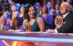
Borrowed from PARADE MAGAZINE online.
ONE story had both potential and proper formatting – it won. I had to ask on Facebook if this block format we see in blogs and such (like this) is now considered a “Standard Manuscript Format” – and NO. No, it’s not. But 19 of 21 stories were in this format (half of those weren’t checked for basic things like spelling errors and missing punctuation), a couple were in smaller than 12 pt fonts, and ONE had EVERY LINE centered like a poem (physically couldn’t read that one). OW! If you don’t know what “Standard Manuscript Format” is? Check out this link – yes, it’s all 1950s, but welcome to publishing. At the very least DOUBLE SPACEIS YOUR FRIEND. PAGE NUMBERS ARE YOUR FRIEND. Actually sending in a SHORT STORY rather than a play or a poem? Yeah, do THAT. Seriously, we got a play and a poem. NOT A SHORT STORY.
The GOOD… because there was a LOT OF GOOD… were the stories themselves. There was a lot of potential talent in that pool. And YOUNGER talent – like college kid age people. I think some were students at one of the colleges but YAY. Next generation! Let’s bring them up right, right? We did a lot of encouragement – even while pounding “Format, format, format”. Because seriously? Could be the next Gone with the Wind but never going to get read if it’s not in proper format. And, dude, I would love to see some of these kids SUCCEED. Seriously, some good potential.
I wish we could’ve talked with the contestants more, but 1 – we spent a lot longer than we were scheduled, and 2 – lost time on sales by going over on a slow sales day. If you want to do in-depth critiques of stories, make it a workshop where your writers are also trying to make money – or space it out over the whole weekend (an hour a day or so). Oh, and make that MUCH clearer to the judges.
OR, have us WRITE it all out and just hand THAT to the contestant and let them come ask us questions. And not take time at the show at all. This was hard (didn’t help that it was cold and damp – but that’s another blog post). If you’re reading this and are aspiring? FORMAT, FORMAT, FORMAT. It’s so important.
[Pen/Pencil Review] Faber-Castell N’Ice Ballpoint Pen
I’m just going to hope this review is somewhat coherent. Just back from Rose City Comic Con, and I’m wiped. This week I show you the pen I picked up from the Dallas Pen Show, basically because it’s the first one I picked up. I bring you the Faber-Castell N’Ice Ballpoint pen.

I bought it for a few reasons – one, I’d never really focused on Faber-Castell before (except maybe in traditional yellow wooden pencils); two, it was cool looking with a model in lime green; and three, it was in my price range. The N’ice ballpoint pen is very modern, but comfortable and well-balanced. The art deco-ish look actually gives the polished, chrome-plated barrel a comfortable grip. The barrel flows into a fun, smooth lime green plastic cap with a molded, wide plastic clip.

The pen extends and retracts the ballpoint with a twist mechanism. The refill is the Faber-Castell black XB. The ink flows well. The ballpoint is smooth and clean. It’s called “document proof” – which I take to be archival quality, acid-free. The quibbly problem is the “XB” part. It’s over a 1.0mm – like a 1.2mm or a 1.4mm, which is WAY too big a line for me. I really want a MUCH finer line than this. They do have them, but I’d have to order them. The refill does look to be the Parker Style, but I’d like to try their finer points even though the refills are a bit on the pricy side.

For something that’s should be fairly common, it’s a beautifully done writing instrument. It’s a touch on the short side – just over 5″ with the ink retracted and about 5.25″ with the ink extended. With the well-balanced build, the length isn’t as big of a deal as it should be. It’s really comfortable and easy to use. I like it.
The numbers:
1. How does it work? – 1 It’s good. It’s a smooth ink writing experience. Long enough to be comfortable and well-balanced.
2. Grip and feel – 1 – Considering the barrel is chrome, Faber-Castell has designed ergonomics into the barrel design. The barrel has finger grips and rests as part of the artistic design to make it fit several hand sizes. It feels good in the hand.
3. Material – 1 Chrome-plated metal for the barrel and sturdy plastic cap makes a strong design.
4. Overall Design – 0.5 – It’s a bit on the short side – and to be perfect, I’d like about another quarter inch. And the stock refill is WAY to bold a line. I feel like I’m writing with one of those big Kindergarten pencils with the XB refill – perfect would be their fine or (at the very least) the medium refill.
5. Price Point – 0.5 – Considering this is Faber-Castell, the price isn’t bad but it’s a higher end ballpoint pen. This pen runs $15 at the pen show and on their website. You can probably get it cheaper on Amazon, but hey, I’d rather buy direct. It’s a good gift pen or a way to be artistic in a business situation. The finer point refills run $5 each.
4.0 out of 5 Bronze Pencils
[Writer Post] Catch Me if You Can…
So, yeah, I remembered on Thursday last week that Wednesday has whooshed right on by. This week is even more of a blur, but I’m doing my darnedest to get all my ducks…somewhere…before heading to Tyler for their Rose City Comic Con. Unfortunately, it looks like Tom Wopat had to cancel, but John Schneider is still coming! And Timothy Zahn, and a bunch of other awesome folks.
Part of the whoosh has been part of that committment to Tyler Rose City Comic Con – I agreed to be a short story contest judge. The deadline for stories is 5 pm TONIGHT, so many of the stories have come in in the last week. I’ve not gotten much done on my own writing for dealing with that. Some of that is typing stuff I started long-hand writing (I do that), and adding to the typing pile.
But one thing I did want to talk about was Star Trek Continues Episode 5 – “Divided We Stand”. Star Trek Continues is one of those web series I will continue to support – and not just because I’ve known Larry Nemecek for years through SF conventions, and have now met Vic Mignogna and Chuck Huber. But because of the INSANE QUALITY and heart this crew puts into the series. It would be so easy just to “recreate” the original series with the cheese and action and call it good. But this crew doesn’t do “easy”. Vic came up with a deep, bold story based on Civil War Earth history and the core concept of Freedom. He also directed this episode flawlessly considering what the story puts Kirk through (go find out what). I’m in awe.
Chuck Huber is a newish addition as McCoy – and this is his real test of what he can do as McCoy in a very, very difficult situation. I think he did a brilliant job. As a voice actor, Chuck can do McCoy’s voice, but this was actually so much more than delivering the lines like McCoy should. This was being “the simple country doctor”. Huber was more than up to the task. When you forget you’re watching actors…that’s a beautiful thing.
This was a deep, powerful story on a couple of levels – PLEASE, PLEASE go watch it and all the other episodes. Can’t wait to see what else they come up with – and they inspire me to reach a bit higher and farther… which is what the originial series did, too, when I was a kid. YAY! Seriously? This makes me a fangirl all over again.
Speaking of Chuck Huber – he and I will be part of the We <3 Art: Creating New Worlds Event on Saturday, November 7th at the main Dallas Public Library. Rachel Caine will be there along with a whole bunch of folks. Come see us there!
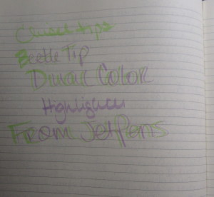
Kokuyo Beetle Tip Dual Color Highlighter – Light Green / Purple
Welcome to Monday and blog post day. I totally bailed on last Wednesday. I’m staring down the barrel of another convention – this one being a comic book convention in Tyler – there’s been a great many things going on. But… it’s Monday.
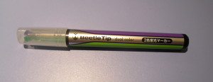
This week is a newish thing… Kokuyo Beetle Tip dual tip highlighter in green and purple. You can use one or the other sides – or you can play a double line. It’s kind of fun. But it’s a highlighter, there’s not a lot new you can say about highlighters…but the dual tip lets you do different things.
This Kokuyo Beetle Tip dual highlighter is 5.2″ long with the highlighter capped and 6.2″ long with the cap posted. It’s a bit wide for the hand – because there are TWO inks in the barrels, and there are no ergonomics, but it’s a cool little tool and not too expensive.
The numbers:
1. How does it work? – 0.5 It’s decent. There are ways that can mess up. You can get green in your purple and purple in your green
2. Grip and feel – 0.5 – This is no frills plastic. It’s a bit wide to be completely comfortable and it’s a simple tube. There are no ergonomics.
3. Material – 1 It’s a no frills plastic with a purpose.
4. Overall Design – 1 – It’s a cool looking, fun tool. You have options for what you need to highlight.
5. Price Point – 1 – It’s pretty affordable.
It’s $2.25 on JetPens. It’s fun, useful, and not an unreasonable investment.
4.0 out of 5 Bronze Pencils